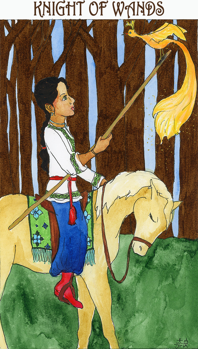
Weekly thingy and the Knight of Wands/The Firebird
The Firebird is another of those characters that turns up across Russian fairytales, like Baba Yaga. She’s usually the object of a quest; the quester who accepts what she gives freely prospers, whereas anyone who attempts to capture her is doomed. My knight here is doing it the smart way; they’re staying calm, letting the firebird perch where she likes and they’ll accept any help she offers.
I’m playing with an option here – my lettering is what it is. It’s . . . rustic is the kind word. To be fair, I’m never trying to make it suuuper clean and precise, it’s not where I want to spend my time and energy and I don’t generally mind the very,very hand-drawn look since these are also original watercolors with little or no retouching. I’m not a slick graphic artist type, I never will be, that’s cool. BUT, I am playing with an option where I pull out my text and drop in computer text instead now that I’ve found a font I like. Please feel free to weigh in either here or on the Facebook page about which you like.


Places to buy stuff!
- TEEPUBLIC: mostly t-shirts, a few other products. Watch for sales, when shirts drop from $20 to $14!
- REDBUBBLE: Just, I don’t know, a ton of different stuff. T-shirts are more expensive than Teepublic, but there are a lot more options.
- AMAZON: Home of the Geeky Gals Coloring Book! Daydreams and Whimsies! AND NOW, The Neurotic Owl Compendium!
- ETSY: paper dolls, a knitting bag pattern, and a bunch of vintage dolls of various sorts from my collection
Did I miss something? I think that’s everything.
What’s making me happy this week:
I did some major reorganizing in my living room including getting a beautiful (says me) rug to cover the ugly fucking tan apartment carpet that I am so fucking sick of living with, and bonus, Mooch looks super luxurious when he washes his butt on it. Unfortunately Ikea has changed their mind about whether they’ll deliver the bookcase I rearranged stuff for but fingers crossed, apparently that’s a thing now that changes on the daily so hopefully if I keep checking back one day delivery will be an option and I won’t have to recruit help. This is the downside of a small car and a second floor apartment, furniture is literally always a pain in the ass.

IF you were asking for opinions, mine would be to continue with your charming, hand drawn titles. (Save this pleasing commercial font for a future project.) There’s merit in continuing as you began–the project will be harmonious.